

Analyze website data with Matomo#
What is Matomo?
Matomo (formerly known as Piwik) is an open-source web analytics platform that works similarly to Google Analytics. With Matomo, you can track:
How many visitors your website has
Which pages are the most popular
Where your visitors come from (Google, social media, direct traffic, …)
Which devices they use (desktop, smartphone, tablet)
When most visitors arrive
How does this help us?
The AI can retrieve, analyze, and visualize your Matomo data. Instead of clicking through Matomo yourself and interpreting the data, you can simply ask the AI questions such as: “Which articles performed best last week?” or “Show me how our homepage developed over the past month.”
The AI understands your questions, retrieves the relevant data, and presents it clearly with charts and summaries.
What are the benefits?
Time savings: No more tedious clicking through Matomo menus
Fast insights: The AI identifies trends and anomalies
Better decisions: Data-driven editorial planning
Automated reports: Can be combined with PDF or Excel export
Overview of features#
The Matomo tool gives you access to the most important analytics features:
Available websites: Lists all websites stored in your Matomo account
Page metrics: Top pages with pageviews, bounce rate, and time on page
Trend over time: How has a page developed over days, weeks, or months?
Time series: Overall website development over a selected period
Traffic sources: Where do your visitors come from?
Devices: Desktop, mobile, or tablet?
Daily traffic pattern: At what times is traffic highest?
Live data: How many visitors are online right now?
How to activate the Matomo tool#
Important
For the AI to use the Matomo tool, you need to mention Matomo explicitly in your prompt.
Examples of prompts that activate it:
“List all websites I can retrieve via Matomo.”
“Ask Matomo how many visitors we currently have.”
“Use Matomo to retrieve the top 10 articles from last week.”
“Show me the Matomo data for FFH.de.”
“Use Matomo to analyze the traffic sources.”
Tip
Also mention the website in your prompt if you have multiple websites in Matomo. For example: “Ask Matomo for the most popular pages on FFH.de.”
If you do not name the website, the AI will ask for clarification or show you a list of your websites.
Top pages and page metrics#
What is this?
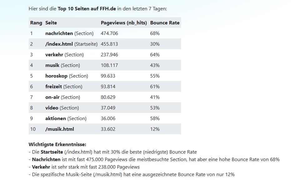
Page metrics correspond to the Matomo feature Behavior → Pages. The AI can retrieve the following metrics:
Pageviews: How often was a page viewed?
Unique pageviews: How many different visitors viewed the page?
Bounce rate: How many visitors left the page immediately?
Time on page: How long do visitors stay on the page?
The AI can also expand individual sections to explore the page structure in more detail (e.g. all subpages within a directory).
Typical use cases
As an online editor, you may want to know:
Which articles perform well?
Which topics are readers interested in right now?
Which pages have a high bounce rate?
Which areas of the website are especially successful?
Tip
Try this prompt:
Ask Matomo for the top 10 pages from the last 7 days on FFH.de. Show me pageviews and bounce rate.
More prompt examples:
“Which articles performed best yesterday?”
“Show me the 20 most popular pages from last month.”
“Which pages in the /sport/ section have the most views?”
“List the articles with the longest time on page.”
Note
The AI can also make comparisons: “Which articles performed better this week than last week?”
Trend over time for individual pages#
What is this?
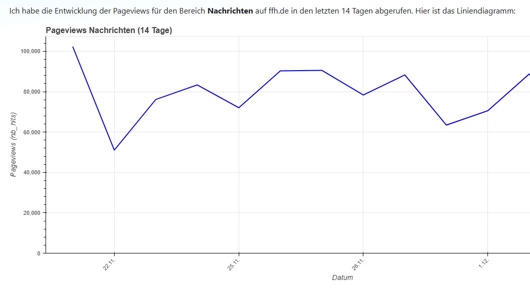
This feature corresponds to Row Evolution in Matomo. The AI can retrieve and analyze the development over time of a single page or a directory across days, weeks, or months.
How does this help us?
You can see:
How does an important article develop over time?
When were there traffic spikes?
How sustainable is an article’s traffic?
Are there recurring patterns?
Tip
Try this prompt:
Ask Matomo for the development of pageviews in the news section over the last 14 days. Create a line chart.
More prompt examples:
“How did our homepage develop over the past month?”
“Show the traffic development of our article about the FIFA World Cup.”
“Analyze the last 30 days for the /podcast/ section.”
“Were there any spikes for the article about the city festival?”
The AI automatically creates charts and can comment on notable patterns, for example: “There was a significant increase in traffic on December 1.”
Website development over a selected period#
What is this?
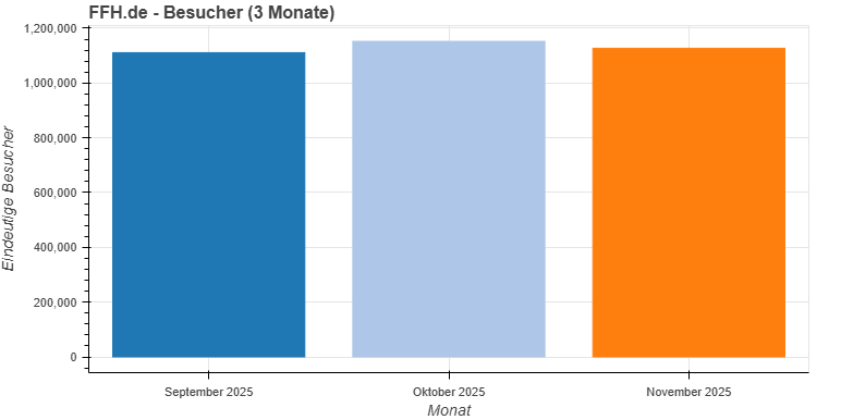
With the time series feature, you can retrieve the overall development of your website over a selected period. This is ideal for:
Monthly comparisons
Yearly comparisons
Trend analyses
Reports for managers
Typical questions:
How many visitors did we have this month compared to the previous month?
How are traffic numbers developing overall?
Are there seasonal fluctuations?
Tip
Try this prompt:
Retrieve the Matomo data for FFH.de from the last 3 months. Show visitor development as a bar chart and explain any notable patterns.
More prompt examples:
“How did pageviews develop over the last quarter?”
“Compare the visitor numbers from November and December.”
“Show me the website’s development over the last 12 months.”
“Was there a traffic drop in October?”
Note
Add context: The AI can also retrieve public holidays and school holidays to better explain traffic fluctuations. Just ask: “Also take public holidays and school holidays in Hesse into account in the analysis.”
Analyze traffic sources#
What is this?
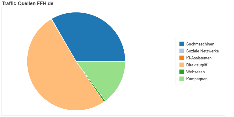
Traffic sources show where your visitors come from. In Matomo, this is called Referrers. The main categories are:
Search engines: Google, Bing, DuckDuckGo, …
Social media: Facebook, Twitter, Instagram, TikTok, …
Direct traffic: Visitors who type in your URL directly or come from bookmarks
Websites: Links from other websites
AI search: ChatGPT, Perplexity, and other AI tools
How does this help us?
You can identify:
Which marketing channels are working?
Is social media work worth it?
How well do you rank in search engines?
Which external sites link to you?
Tip
Try this prompt:
Ask Matomo for the traffic sources of FFH.de over the last 7 days. Create a pie chart.
More prompt examples:
“How much traffic comes from search engines?”
“How many visitors come from AI search engines such as Perplexity?”
“Compare the traffic sources from this week and last week.”
Device analysis#
What is this?
Device analysis shows which device types your visitors use to access your website:
Desktop (computer, laptop)
Smartphone (mobile)
Tablet
How does this help us?
This data helps you decide:
How important is mobile optimization?
Which screen sizes should we optimize for?
Is user behavior different between desktop and mobile?
Tip
Try this prompt:
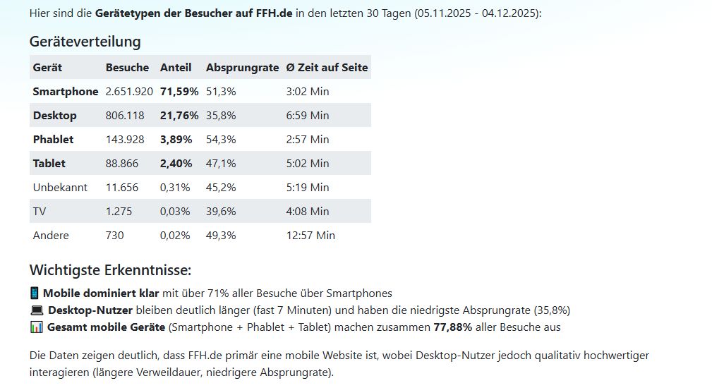
Ask Matomo which devices our visitors use on FFH.de. Show the distribution for the last 30 days.
More prompt examples:
“How many visitors come from smartphones?”
“Has mobile usage changed compared to last year?”
“Show the device distribution as a bar chart.”
Hourly traffic pattern#
What is this?
This feature shows at which times of day most visitors come to your website. Ideal for planning:
Publishing times
Social media posts
Newsletter sending
How does this help us?
You can optimize your content strategy:
When do we reach the most readers?
Is there a “prime time” for our website?
Do weekdays and weekends differ?
Tip
Try this prompt:
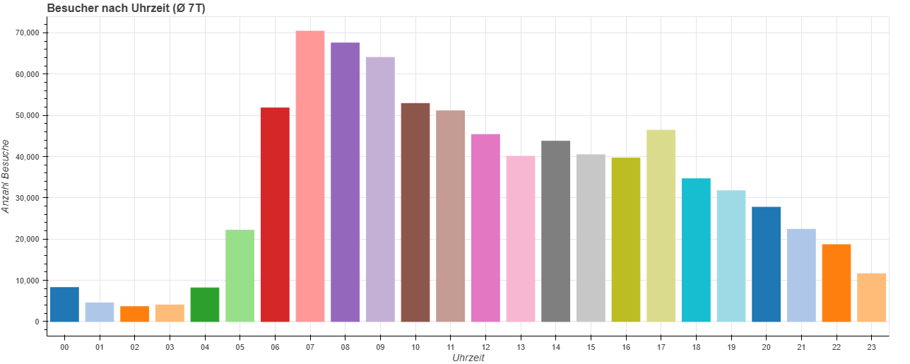
Ask Matomo at what times most visitors are on FFH.de. Show the average daily traffic pattern of the last 7 days as a bar chart.
More prompt examples:
“When do we have the most visitors?”
“At what time should we send our newsletter?”
“Are there differences between weekdays and weekends?”
“Analyze the daily traffic pattern of the last 30 days.”
Live data: Who is online right now?#
What is this?
With live data, you can see in real time how many visitors are currently on your website. This is especially useful for:
Breaking news
Live events
Product launches
Campaign monitoring
How does this help us?
You can immediately see whether an article is gaining traction or a campaign is starting to take off.
Tip
Try this prompt:
Ask Matomo how many visitors are currently on FFH.de.
More prompt examples:
“How many users are currently online?”
“Show me the live visitor numbers.”
“Is our newly published article getting off to a good start?”
Combining it with other tools#
The Matomo tool can be combined very effectively with other tools:
Create charts#
The AI can automatically visualize Matomo data:
Line charts for trends over time
Bar charts for rankings and comparisons
Pie charts for distributions (e.g. traffic sources)
Simply mention it in your prompt: “Create a line chart” or “Show this as a bar chart”.
Export as PDF, Word, or Excel#
You can export analyses directly:
Tip
Try this prompt:
Create a report on the top 20 articles from last week with pageviews and bounce rate. Export the result as a PDF on letterhead.
More export examples:
“Export the traffic sources as an Excel file.”
“Create a monthly report as a Word document.”
“Save the analysis as a PDF.”
Context through public holidays and school holidays#
The AI can retrieve public holidays and school holidays to better explain traffic fluctuations:
Tip
Try this prompt:
Analyze the Matomo data from FFH.de in November. Take public holidays and school holidays in Hesse into account and explain any notable patterns.
Calculations and comparisons#
The AI can use the calculator tool to perform calculations:
Percentage changes
Averages
Growth rates
Projections
“What percentage increase in visitors did we have this month compared to the previous month?”
Tips for meaningful analyses#
1. Choose time periods wisely
For current trends: last 7 days
For monthly comparisons: full calendar months
For yearly trends: 12 months
2. Ask specific questions
Instead of: “Show me Matomo data”
Better: “Which 10 articles had the longest time on page last week?”
3. Add context
Name the website
Specify the time period
Explain what you want to know
4. Use visualization
Ask for charts - they make trends visible instantly.
5. Make comparisons
This week vs. last week
This month vs. previous month
Weekdays vs. weekends
Example workflows from day-to-day editorial work#
Morning briefing#
Tip
Prompt for starting the editorial day:
Good morning! Ask Matomo for the top 5 articles from yesterday on FFH.de. Show pageviews and time on page. Which topics performed especially well?
Weekly report#
Tip
Prompt for the weekly review:
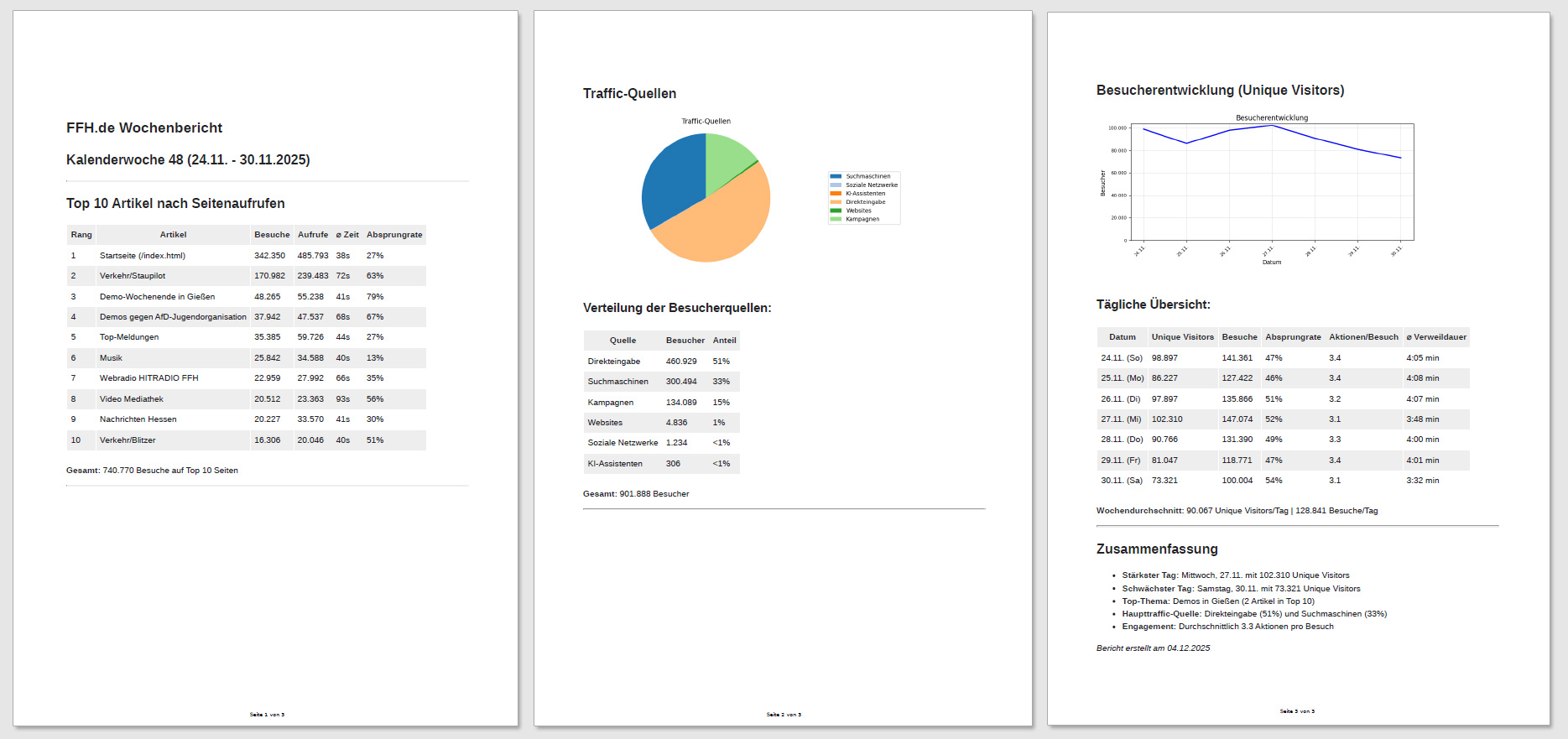
Create a report for the last week on FFH.de. Retrieve the Matomo data and show: - Top 10 articles with pageviews - Traffic sources as a pie chart - Visitor development as a line chart Export everything as a PDF.
Topic analysis#
Tip
Prompt for content strategy:
Analyze all articles in the /lifestyle/ section from the last 30 days. Which topics perform especially well? Which have high bounce rates?
Investigate a traffic drop#
Tip
Prompt for issues:
Visitor numbers are lower than usual this week. Analyze the Matomo data from the last 14 days and compare it with previous weeks. Also check whether public holidays or school holidays may be playing a role.
Comprehensive analyses#
If you want to understand your website holistically, choose a powerful language model that is capable of performing complex data analyses. Models such as Claude 4.5 Sonnet, GPT-5.1, and Gemini 3 Pro are especially well suited for this. They can decide for themselves which metrics and visualizations best fit your request and provide deep insights into your Matomo data.
Make sure all required tools are enabled by mentioning them in the prompt: Matomo, charts, public holidays, school holidays.
Tip
Comprehensive analysis:
Use Matomo to create a comprehensive analysis of FFH.de. Retrieve all relevant data from the past six months and create a detailed evaluation including traffic sources, user behavior, and device distribution. Use charts for visualization and take public holidays and school holidays into account. Compare the results with performance in the same period last year. Use the calculator for calculations. Create a complete, well-structured report.
Automate reports#
Create AI workflows for weekly, monthly, or quarterly reports and have them sent automatically by email to you or your team. In the workflow, you can, for example, specify that the most important results should already be summarized in the email and that the detailed report should be attached as a PDF.
Frequently asked questions#
Can the AI access all my websites in Matomo?
Yes, the AI can retrieve all websites stored in your Matomo account. Just mention the desired website in your prompt.
How far back can I retrieve data?
As far back as you have data stored in Matomo. In most cases, that means several years.
Can the AI also compare multiple websites?
Yes! For example, ask: “Compare the traffic figures of FFH.de and planetradio.de over the last month.”
Is the Matomo data stored?
The AI retrieves the data in real time and does not store it permanently. For reports, you can export the results as PDF, Word, or Excel.
What if the AI analyzes the wrong website?
Mention the website explicitly in the prompt: “Analyze the data for FFH.de.”
Can I run multiple analyses at once?
Yes! For example: “Create a comprehensive report with top pages, traffic sources, device distribution, and time-based development for last week.”
Try it now!#
The Matomo tool makes data analysis as easy as having a conversation. Instead of clicking through menus, you simply ask questions in natural language.
Tip
Start with this simple prompt:
Ask Matomo for the top 10 pages from the last 7 days on [YOUR WEBSITE]. Show the pageviews as a bar chart and explain which topics are performing well.
Good luck with your analyses! 🚀